YouTube is making a minimal but nifty change to the user interface of its mobile application on Android. A design change which had been under testing for several months — a bottom navigation bar has today started rolling out more widely to Android users across the globe. It has only debuted a handful of other design changes, with rest of the app remaining mostly unchanged.
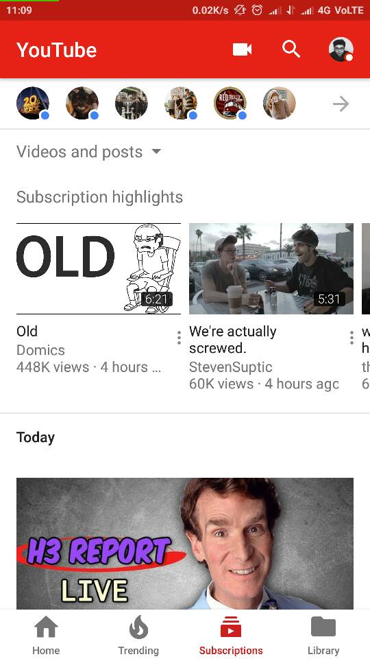
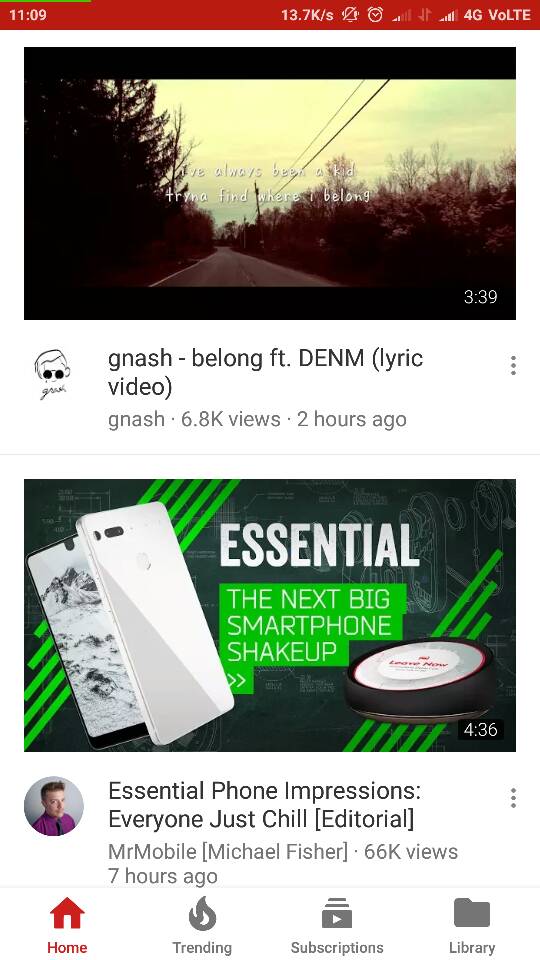
The four tabs that were previously present at the very top of the app have been replaced with a bottom navigation bar. Previously, the same were amalgamated into the ‘signature’ red color header of YouTube but it has now been transformed into a white one at the very bottom of the screen. They no longer feature only the icon but also add the corresponding tag to the same.
This user interface is a more favorable design choice as the bottom bar brings the navigation buttons closer to the user. Though you earlier had the option to swipe through the four tabs, namely Home, Trending, Subscriptions, and Library, this functionality has now been removed. The bottom bar remains visible at all times, except for when you’re watching videos. You can also easily pick up from where you left, as described in the forum:
For example, if you scroll down through the Home feed, then go to your Subscriptions tab, and then return to Home, you can easily pick up where you left off.
YouTube seems to be of the opinion that you can now tap on individual tabs, which are closer to your reach and do not require to swipe through them to access the different feeds. An important change to the features of the updated YouTube app will have to be the fact that your video Library and Account section have been separated.
The library tab is now available in the navigation bar at the bottom whereas the account section is now available at the very top at the right corner, next to the search icon. You can long press the account icon to switch between multiple accounts with ease.
The new navigation bar at the bottom has already gone live for iOS users but is steadily being rolled out to Android users at the moment. You will need to update your YouTube app on Android to receive the latest design update. And if you don’t see the design change pop up in your app, like I didn’t, then try cleaning your app data (cache) to gain access to the new layout. The said method worked for me and I now have the latest user interface.
The Tech Portal is published by Blue Box Media Private Limited. Our investors have no influence over our reporting. Read our full Ownership and Funding Disclosure →


2 comments