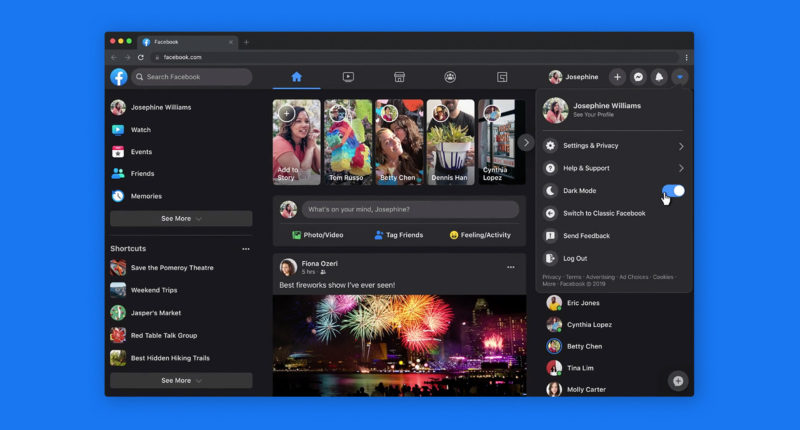
It has been in talks for quite a while and Facebook’s latest update is finally here and ready to use. Ever since it’s launch, more than a decade ago, Facebook has undergone innumerable changes and reconstructions ranging from content organisation to easier and faster application. The one today is a part of that, and a good one so as to say. Announced at F8 last year, it will now be the web experience for Facebook globally.
Quite certainly, the biggest talking point for this redesign is the dark mode. After being released on various other social media applications like, Instagram, Twitter and even Youtube, Facebook has at last enabled the dark mode and that too for the desktop. The new dark mode lowers brightness, alongside contrast and vibrancy, thus minimilaising overall glare on your eyes.
Not just dark mode, but the redesign that has gone live today also promises faster loading and bigger text. The website dawns a simpler and cleaner look which makes it more user-friendly than ever. Talking about a ‘Fresh Facebook’, the company wrote about how it laid emphasis on the mobile app and even took pointers from it, considering that it has been doing better than the desktop website. “We’ve grown since Facebook.com launched 16 years ago“ they said adding how “people need to keep up.”
The brand new version might require some time to get used to as it now provides people with the facility of ‘previews’ for all content in order to help one choose better. Communities looking to create groups and pages can now get real-time previews. One can preview a new Group you’re starting in real time, and see what it looks like on mobile before you create it.
The Tech Portal is published by Blue Box Media Private Limited. Our investors have no influence over our reporting. Read our full Ownership and Funding Disclosure →


