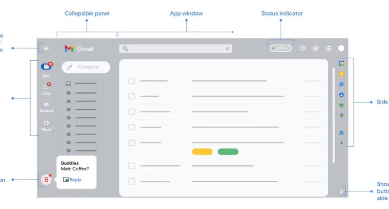
Google has rolled out the new design for Gmail that was announced in January. The update, apart from aesthetic changes, focuses on closer integration of Gmail, Meet, Chat and spaces.
Right off the bat, it is noticeable that the Gmail logo on the top left has shrunk. The interface has two new panels on the left. The outer panel houses icons for Chat, Meet and spaces. These icons also display notification bubbles. The inner panel is a visual rework of the gmail functional panel, which includes the stat options like inbox, sent mail, outbox, spam, junk etc. The update makes the interface a bit more casual, with the aesthetic focused on rounded corners rather than sharp edges. The principle is visible in the form of a rectangular Compose button and the search bar, both of which have rounded corners.
The new design is based Google’s Material 3 design. It also includes behind-the-scenes additions to tackle with spam, phishing and malware protection. Google explain’s Material 3 as an “adaptable system of guidelines, components, and tools that support the best practices of user interface design.”
Gmail has provided users with a considerate option to revert back to the old design if they choose to. The procedure is pretty simple.
- At the top right, click Settings.
- Under Quick Settings, click Go back to the original Gmail view.
- In the new window, click Reload.
Google also announced that Gmail will be getting Tablet device optimizations, better emoji support and more accessibility features over the course of this year.
The Tech Portal is published by Blue Box Media Private Limited. Our investors have no influence over our reporting. Read our full Ownership and Funding Disclosure →


