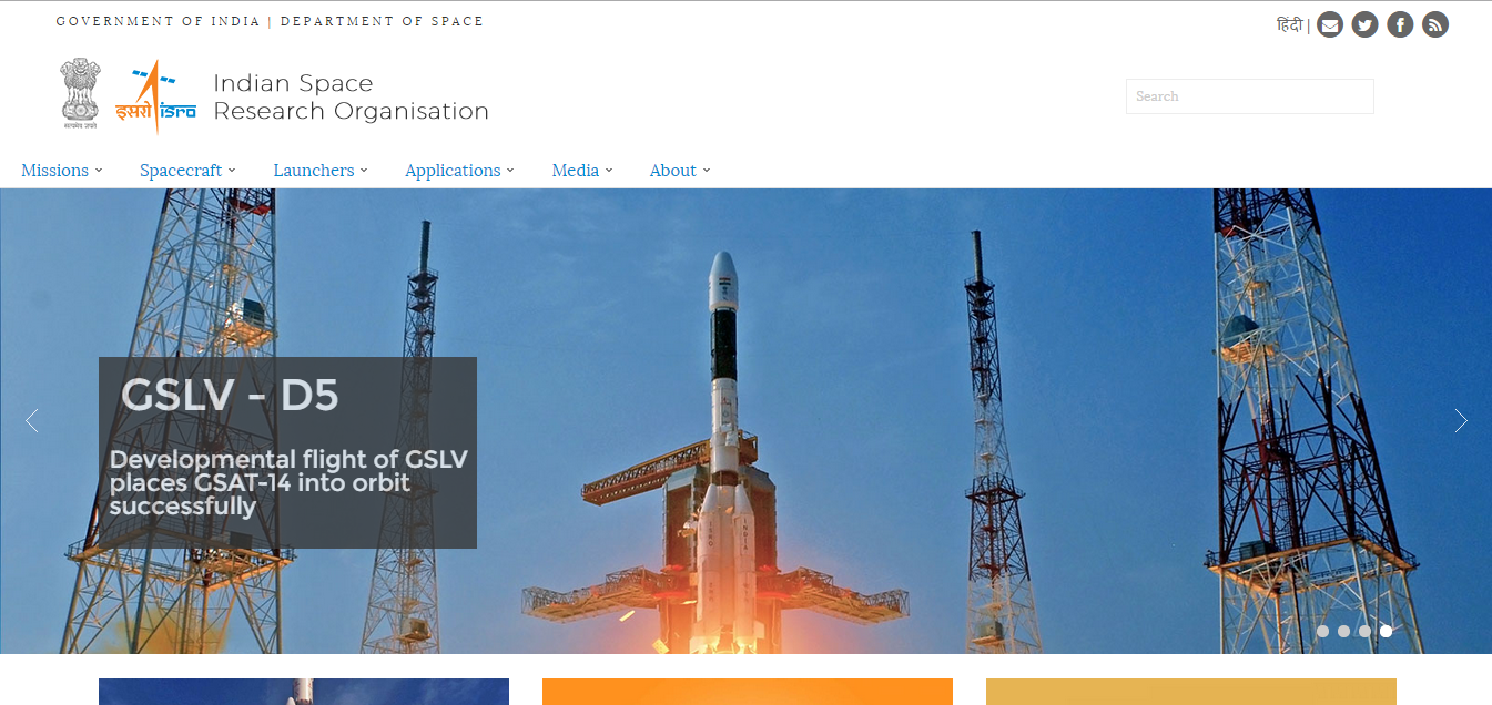
Finally, an icing on the cake. This has been an eventful year for India as far as space exploration is concerned, and to top it all, the space agency now has a fully revamped, modernised website. The new website, is a true reflection of ISRO’s transformation from a developing space agency to an established space power.
ISRO has several commendable feats to its name this year. It successfully put the Mars Orbiter into Martian orbit, becoming the first Asian nation and the fourth overall to achieve such a feat. ISRO also successfully tested its heaviest rocket, the GSLV Mk. III (which is also one of the heaviest on the globe as of now), with capabilities of launching a manned mission.
The space agency power also successfully launched several satellites, including the extremely important, GSAT 16. It also launched the third iteration (IRNSS -1C) of India’s indigenously developed, Indian Regional Navigation Satellite System (IRNSS).
Coming to the design aspects of ISRO’s revamped website, it is a serious tangent from India’s traditional government department websites. The website is completely based on Modern UI (commonly known as Flat UI) design elements, with use of modular fonts and bold graphics. For the very first time in my personal experience of browsing Government websites, I see a design which is finally responsive in nature. For those of you who do not understand the term responsive, it is basically a feature wherein a website adjusts its dimensions as per the screen size of the browsing device, without destroying the design elements.
The drop down menus are excellent, with smooth sliding animations. Finally ! Finally ! We’ve finally come off age of using those glitzy flash animations on the top banner, featuring the iconic wavering Indian flag and some shining stars (I seriously never understood the point of featuring those blinking stars up there).
However, do note that ISRO is now hosting its website on Indian Government’s secured servers. Rather than using the older .org domain, the new website now uses a .gov.in extension. However, you can still visit the website through its older address.
This website, as mentioned earlier, echoes India’s rapidly modernising space technology with capabilities of launching interplanetary and manned space missions. In fact, I also see a change in ISRO’s motto. While it earlier read as “Space Technology in the service of Mankind”, it has now changed to
Harness space technology for national development, while pursuing space science research and planetary exploration
This further corroborates the point I’ve been making, as this new motto brings in the “planetary exploraition” angle into India’s space program.
There’s still room for improvement though. As India’s younger generation gets more deeply involved in India’s ambitious space program, there has been a popular demand for a modernised, NASA TV-like ISRO-TV channel, which can show every launch, LIVE. We hope ISRO listens to this. You can visit this brilliantly revamped design, here.
The Tech Portal is published by Blue Box Media Private Limited. Our investors have no influence over our reporting. Read our full Ownership and Funding Disclosure →


3 comments
ISRO makes every Indian proud. First Mars mission and recently successful tested the GSLV Mark 3. By the way the new website design looks pretty sleek.
And the timeline Looks awesome..check out the first sounding rocket..
Nice to have a separate web site for ISRO TV for public to view.But ISRO’s interaction with youth and students have to be made more freely and transparently ,,then only more participation by public will be there.