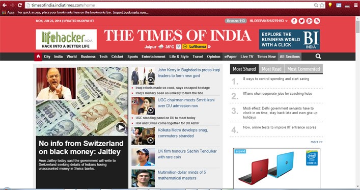
If you are a regular at timesofindia.com, then you might have noticed a big change on its website. Well, the change is currently implemented only on the home page, hence we think, it is still in a testing phase.
The new design may not be drastic but was much required. The age-old design, clearly made it feel backward in front of even Indian dailies, forget about the international ones.
The new beta design is modular and flat, and is in context with today’s modern web designing. The top barretains the same background color, red, with a tinge of white hue, giving it a flat UI feel.
Once you scroll down the website, a “much-needed‘ constant top bar, containing all the sections appears, thus making site navigation much much much easier than before. All the sections listed have their regular sub-menus, but transformed into a good-looking modern UI interface.
The top headlines, which earlier used to appear as a simple [ h1 ] heading tag, now finally look more appealing and attractive.
We haven’t spotted any changes on pages other than the homepage, but we hope, that gradually, the entire website will come to a new look. And if it doesn’t, then there are lots of questions, which can be put up on the web designing and development team at TOI.
TOI had bore a lot of grunt in the past 2-3 years, for its never-changing, too full of ads, uninspiring website, which made us feel as if we are reading a simple HTML website. Although the ads are still there (and lots of them) but the new UI, definitely makes website look more appealing and attractive.
The Tech Portal is published by Blue Box Media Private Limited. Our investors have no influence over our reporting. Read our full Ownership and Funding Disclosure →


