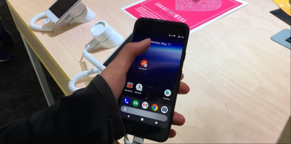
Google is allegedly planning to give its Pixel launcher, debuted earlier last year, a complete overhaul with the upcoming update. Courtesy of Google-focused publication 9to5Google, we’ve got our first look at this brand new user interface (UI) that was being shown off at a Google I/O Sandbox session related to Instant apps. Note, this is an unreleased version of the Pixel launcher and hasn’t been seen ever before.
Even though the demo video attached below is just 18 seconds in length but the difference is prominent and you’ll be able to spot it out the moment you hit play. The noticeable change, which catches the eye, is that the said version of Pixel launcher has lost the Google Pill (for searching the interweb) and clock combo at the top of the screen. The G pill used to sit on the top left and tapping the same popped open the search bar.
This minimalistic setup is most likely being replaced with something unexpected — a translucent Google search bar at the bottom, under the row of pinned dock icons of the Pixel launcher. This is an especially odd, but satisfying position, to place the search bar as you no longer have to work hard and readjust your grip on the huge phablet-sized phone to access the Google search bar. It comes with rounded edges, a whitish tint, and can be tapped to instantly open the search bar up top. At least, that remains same.
This could become an obvious replacement choice for Google as it eases access to their search engine. And if you ask anyone, this would probably be one of the most used features of Android phones, so according to me, moving the search box to the very bottom of the Pixel launcher is a wise choice and will be preferred by power users. This markets ease and comfortability and I am hands-down supporting the said change. The top is now reserved for only the clock/date widget.
In addition, one change that isn’t noticeable on the surface will have to be in the search functionality. 9to5Google mentions that the previous Pixel launcher allowed users to search for apps you already had installed on the smartphone. This is also true for the brand new version but has now been expanded to include the functionality to search for apps you’d like to install from the Play Store. This has been shown off in the video attached below and works for Instant Apps as well.
There is presently no official word on the redesign but we can expect the changes to debut soon enough with the Android O update to Pixel and Nexus devices. It could be a great testbed for gathering feedback on the major change with the google searchbar, if they’re being actually shipping the change. We recommend you to take this redesign with a grain of salt as it is highly possible that this leak was accidental and a test product had been demoed on the show floor.
But, we’d like to hear your opinion of this major design choice for the Pixel launcher. Comment your thoughts down below, let’s discuss the pros and cons of the same.
The Tech Portal is published by Blue Box Media Private Limited. Our investors have no influence over our reporting. Read our full Ownership and Funding Disclosure →
Our Staff writing team.


