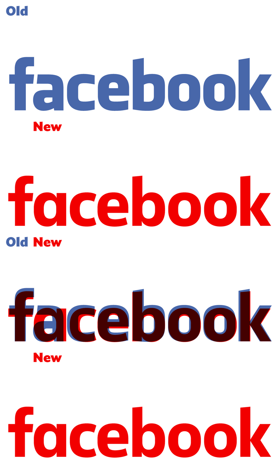
Remaining unnoticed to most, Facebook quietly tweaked its wordmark yesterday, with the social networking giant doing away with the original “Facebook font” and bringing a cleaner, more straighter font into the play.
The new logo isn’t a complete revamp to the old one, just a slight update. It’s even hard to notice the difference unless you actually compare the logos side by side.
The ‘f’ logo will still remain the same though and only the ‘Facebook’ workmark has been updated. Erik Olson, the designer of Klavika, the font used for the original wordmark, was brought in by the company to design a new typeface for the updated logo.
Josh Higgins, Facebook’s Creative Director told Brand New:
When Facebook’s logo was first created in 2005, the company was just getting started and we wanted the logo to feel grown up and to be taken seriously. Now that we are established, we set out to modernize the logo to make it feel more friendly and approachable. While we explored many directions, ultimately we decided that we only needed an update, and not a full redesign. We worked with Eric Olsen — whose typeface Klavika was used in the original logo — and developed a custom typeface to reflect where we are now and where we are headed.
A suggestion for a change of logo was earlier proposed by Ben Barry, a former designer at Facebook and even though this was approved, the change was never brought about.
The original logo was designed in 2005 by Joe Kral and Cuban Council using Process Type Foundry’s Klavika as a starting point. As for the new one, the change, though in the longer wordmark, is still considerably visible, highlighting the sheer impact which Facebook has had on our lives.
For a more detailed outlook on the new logo, you can visit this piece written by Brand New’s Armin.
GIF : BRAND NEW
The Tech Portal is published by Blue Box Media Private Limited. Our investors have no influence over our reporting. Read our full Ownership and Funding Disclosure →


