This is most likely not the first time you’ve heard that Google is developing another new operating system to complement its existing offerings. Earlier in 2016, we reported that the tech giant was moving past Linux-based Android and Chrome OS to develop its brand new operating system called Fuchsia.
It seems the operating system has now moved beyond just code commits to build the command line interface, we previously spotted in the wild. The project has, however, started taking shape as we’ve today been given a sneak peek at the snappy and flowing interface of the Fuchsia OS. It is still far from complete but at least we get hold of the direction Google is adopting to build its very own OS from scratch.
This development was initially spotted by ArsTechnica, who’s provided us with a gallery and video (attached below) of the new user interface. Google is still not parting ways with its infamous card design, which has been imbibed in Fuchsia well. The user interface, here, has been named Armadillo and we have been provided an APK to try out the same right away (oh, fluttering!) The UI was first spotted by Kyle Bradshaw over at Hotfix, who says it’ll be the default system UI for Fuchsia.
The UI Android app has been compiled using Google’s Flutter SDK, but you should first know a little about Fuchsia’s underlying code. The new operating system is parting ways with Linux and is being built Magenta kernel and LK(Little Kernel). The latter is best suited for building lightweight components, while the former is being used to build the groundwork for the operating system.
Google is using this kernel to build the inner constructs (threads, memory, etc.) based on LK, which means Fuchsia will be scalable. It will not only be supported by smartphones but personal computers as well. Magenta has been designed for, as the official documents describe it,
modern phones and modern personal computers with fast processors, non-trivial amounts of ram with arbitrary peripherals doing open ended computation
Coming back to Flutter SDK, it has been released to build cross-platform code for multiple operating systems like Android, iOS and now Fuchsia. It is probably taking the Windows 10 route, thus, Flutter is being employed to make it easier for developers to port the apps over to the new platform.
The APK has been compiled using the Flutter SDK, providing us an insider look at how simplistic and futuristic (can’t we say that!? because it feels like a mobile device from a sci-fi movie) the user interface will finally be. You can also pick the source code to compile the code into an Android app.
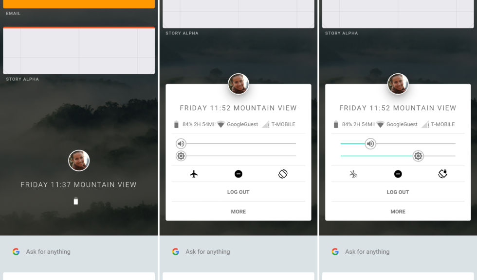
As for the characteristics of the user interface, the home screen is clean and free of any clutter. Armadillo has been designed as this lengthy scrolling list, where you first see the profile picture in the center, recent apps at the top, and Google Assistant section at the bottom. You can scroll either way to navigate within the operating system and there seems to be a lack of an app drawer and settings option.
The profile picture in the center can be tapped to access a handful of quick settings, along with other info such as battery percentage, WiFi, and carrier name. You can also see options for brightness, flight mode, sounds and others in this section. Just tap anywhere in the area outside the white profile card to move back to the scrolling window.
Coming to the scrollable list inside Fuchsia, you can scroll down to access the recently opened apps or notifications — which has not been made clear in the demo as of now. The said app card animates and expands at that very location, instead of taking you to a new screen like it presently does.
This interface looks similar to the recent app tray in Android and also offers you the ability to drag screen and place them split-screen or in a tabbed interface to further ease the multitasking process. It is way more flexible than Android and any number of apps can be placed anywhere on the screen.
The Google Assistant page looks quite similar to the existing interface, but with minor changes like the card opens in the recents app section — the one we talked about above. This is just the basic Armadillo design for Google’s upcoming OS offering, Fuchsia, and we are not sure what will finally come out of the same.
The design and interface, as a whole, are subject to change until an official release. Google is looking to reduce the dependency of third-party technologies, Linux and Oracle’s Java libraries to build a software of its own. It will surely be fluid and just as classy, as shown in the demos. Thus, we’re keeping our finger crossed and hope for something positive out of this initiative — that too sooner than we expect (two or three years).
The Tech Portal is published by Blue Box Media Private Limited. Our investors have no influence over our reporting. Read our full Ownership and Funding Disclosure →


