

Facebook has now started rolling out a new, radically re-designed version of its desktop platform, something that it had initially started testing with a set of select users. The new design, as is evident, is here to provide a more app-like experience to those who still use desktop as their primary device to browse the social network.
The new design, which was announced in the company’s F8 conference last year, is also pretty much in sync with the Facebook app design. The purpose, from the looks of it, seems to provide a sense of continuity across devices.
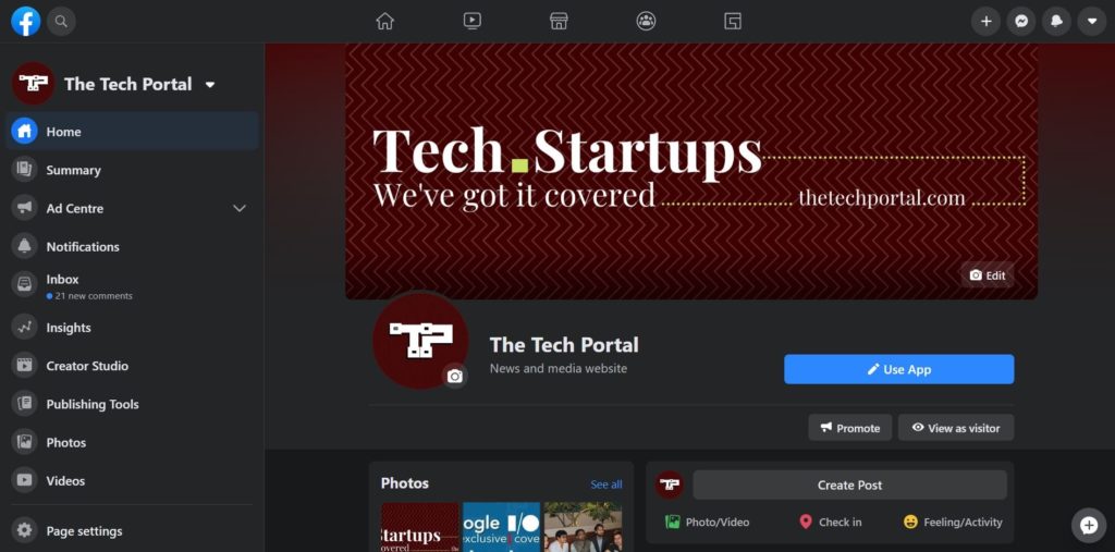
The devices, which Facebook has officially started rolling out to most users globally, can currently be accessed using a switch feature. A user can click on the top-right downward pointing arrow (right beside your profile name), and select “Switch to New Facebook” from the drop-down. Once selected, the user is directed to the new design, with a brief guide on how it works.


Users can switch back to the older design using the same process. Facebook plans to make this new look, the default for all users, starting later this year.
Public testing of this new design started happening some time in October last year. And it seems feedback has been largely positive, resulting in this global roll-out starting today.
There is a ton of stuff to like about the new design, not to mention the dark mode. The overall navigation is much more streamlined with easier access to Groups, marketplaces and more. A lot of clutter has been done away with to make way for larger fonts and much more screen spacing. It also looks much more sensible to have the dark mode in this design.


Even though the current default design was updated a few years back, it kind of felt out of place when compared with modern design language that you see in most apps, specially social media. Designs these days have seen several changes, some smaller ones like switch to rounded rectangles instead of flat ones, and some larger ones such as desktop experiences now being dictated by mobile versions.
For Facebook, these re-designs are more about continuing to stay on top, 16 years after launch. Desktop designs are far more critical and intricate, as compared with mobile designs. Mobile apps, benefiting from smaller screen real estate, can shove up all customised options in one single navigation drawer. That isn’t the case with Desktop. And even though Facebook is primarily being viewed on mobile, content creators, journos and others still used desktop versions to post stuff. And that is critical, as it drives viewership and ad moolah.